
Here it is: The new AA livery
January 17, 2013 on 9:15 am | In Airline Fleets | 3 CommentsUpdate 04: Best funny comment I’ve seen so far is: “So, I see AirFrance and Pepsi had a Cubana love child??” Seen on Airliners.net.
Update 03: I am amused. I’ve seen it suggested on Terry Maxon’s blog that the livery is inspired by Greyhound (which gave me a good laugh but no doubt really isn’t true.) On a third pass over the livery, now I’m feeling like it was designed for the United States Postal Service. What I’m not getting is any strong connection to the history of American Airlines. It didn’t inspire me forward and it didn’t connect me to all that is positive about AA’s history.
Update 02: So far, I am not seeing much in the way of positive response to this livery. I expected quite a few people to immediately dismiss it but I also thought I’d see some people speak out for it. Not yet.
Update 01: It would be very easy to see the US Airways logo embodied in that tail design, I think. What I’m referencing is the bar representation. I suspect Doug Parker would be OK with it mostly.
I also think that the billboard title is less obvious than it could be against that fuselage.
I’m still digesting it, however.
Here it is. A screenshot of their new livery captured from American Airlines’ website.
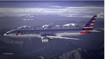
I think this new livery is going to spark a lot of controversy. My own thoughts: My first reaction to the tail wasn’t good but it’s already growing on me. I don’t like the highly stylized “aircraft tail” symbol in front of the billboard titles for American. For some reason, it reminds me of Lan Chile. I also don’t like how they’ve extended the red bars of the tail down below the horizontal stabilizer.
My first reaction is to give this a B or B+. I feel like I’ve seen better created by amateurs online. But let’s digest this one first before going all Pulp Fiction on it. I actually liked THIS and THIS one more.