
Here it is: The new AA livery
Update 04: Best funny comment I’ve seen so far is: “So, I see AirFrance and Pepsi had a Cubana love child??” Seen on Airliners.net.
Update 03: I am amused. I’ve seen it suggested on Terry Maxon’s blog that the livery is inspired by Greyhound (which gave me a good laugh but no doubt really isn’t true.) On a third pass over the livery, now I’m feeling like it was designed for the United States Postal Service. What I’m not getting is any strong connection to the history of American Airlines. It didn’t inspire me forward and it didn’t connect me to all that is positive about AA’s history.
Update 02: So far, I am not seeing much in the way of positive response to this livery. I expected quite a few people to immediately dismiss it but I also thought I’d see some people speak out for it. Not yet.
Update 01: It would be very easy to see the US Airways logo embodied in that tail design, I think. What I’m referencing is the bar representation. I suspect Doug Parker would be OK with it mostly.
I also think that the billboard title is less obvious than it could be against that fuselage.
I’m still digesting it, however.
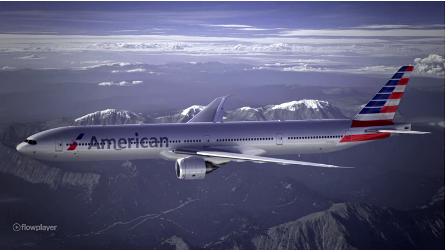
Here it is. A screenshot of their new livery captured from American Airlines’ website.
I think this new livery is going to spark a lot of controversy. My own thoughts: My first reaction to the tail wasn’t good but it’s already growing on me. I don’t like the highly stylized “aircraft tail” symbol in front of the billboard titles for American. For some reason, it reminds me of Lan Chile. I also don’t like how they’ve extended the red bars of the tail down below the horizontal stabilizer.
My first reaction is to give this a B or B+. I feel like I’ve seen better created by amateurs online. But let’s digest this one first before going all Pulp Fiction on it. I actually liked THIS and THIS one more.
I love that they’re getting rid of the awful aluminum and that they didn’t go with a white fuselage like everyone else and their mother. I love how those vertical stabilizers look all lined up at the gate. I (almost) love the new logo. But the overall livery? HATE IT.
That Cubana love child comment had me cracking up — sums it up quite nicely. It’s like they had four or five great ideas, couldn’t decide, and threw them all on the poor airplane to create quite a cluster you-know-what.
I saw the first 773 in Paine Field before it was painted and the anticipation was palpable. Talk about a buzz kill! I like seeing it on a real airplane (http://www.airliners.net/photo/American-Airlines/Boeing-737-823/2214582/L/) a bit more than the cartoon version, probably because I’m quite the 737 fan, though…
(I’ve missed reading your blog! I went to nursing school and life stopped for a year. Now I’m free and back to being a dedicated airplane geek!)
Welcome back!
AT the end of the day, the livery just doesn’t move me or connect me. Branding should do that. It’s not a question of hanging on to the old livery as I thought it had become abysmal for today’s times. It’s not a question of wanting “traditional” liveries. I like new and I like modern. I like a lot of new liveries that I am seeing in the world (Finnair is a good example). I don’t mind connections to the US flag or other emblems of the United States for AA.
The flag is . . . generic to me.
The logo typeface is OK but I’m not real keen on the Grey on Grey scheme. The blade has potential but I can’t really say that the eagle stands out as a stylized eagle as much as it could.
I still say I’ve seen better amateur designed AA liveries.
Absolute CRAP! Looks like they are ready to inaugurate service to every Communist Country in the world. The two other examples are SUPERB. There is just nothing that connects AA with its history or its future. Just a big mess.